
Based in Massapequa, New York, film student and customer service professional Andrew Laurendi studies filmmaking at The Los Angeles Film School, following earlier coursework in communications and film at Long Island University Post and Nassau Community College. His curriculum includes cinematography, color correction, audio production, digital literacy, and screenwriting, which connect directly to the practice of color choices on set and in post. Workplace roles at Whole Foods and Stew Leonard’s strengthened communication, organization, and multitasking that support collaborative production work. He has also volunteered with HorseAbility, assisting participants, events, and administrative tasks. In this overview, the topic of color theory in cinematography is presented in a concise, practical frame, emphasizing how palettes, grading, and harmony guide storytelling, mood, and character psychology.
A Look At Color Theory in Cinematography
Color theory in cinematography involves using color to shape atmosphere, guide emotions, and deepen storytelling. Color does more than decorate the scene in film; it also speaks directly to the audience’s subconscious. This is why cinematographers and colorists use hue, contrast, and saturation to reveal character psychology, strengthen narrative themes, and influence mood. Understanding color on a screen means understanding how viewers actually feel before they hear a word of dialogue.


Every color carries emotional weight, and cinematographers take advantage of it. Warm hues like gold, orange, and red usually evoke a sense of romance, comfort, human connection, and nostalgia. These tones usually make scenes feel intimate, dream-like, or hopeful. Cooler colors like green, cyan, and blue are often indicative of sadness, tension, sterility, and isolation. Dramas and thrillers often lean toward cool palettes to create emotional distance or unease.
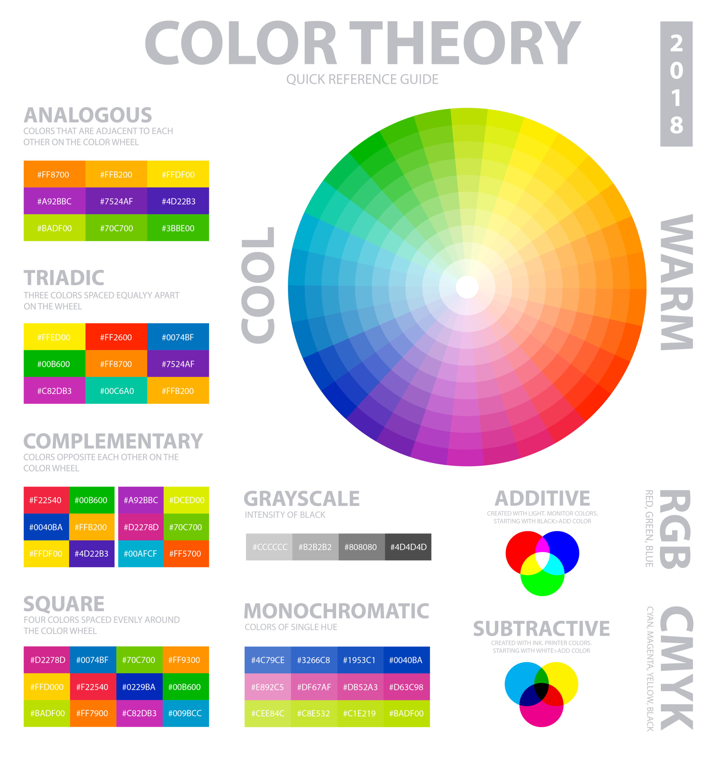
Cinematographers do not just randomly pick colors; they develop palettes based on contrast and harmony. Complementary color schemes like orange and teal are common in modern cinema because they create an obvious distinction between backgrounds and skin tones. Analogous palettes with colors close to each other on the color wheel often feature smoother, more emotional transitions, making them best suited for reflective and romantic stories. The intentional color harmony guides the viewer’s eyes and fosters emotional clarity. For instance, a scene can feel either peaceful or tense and fractured due to the relationships between colors on screen.
Furthermore, cinematographers use color to communicate symbolism and one’s internal state. For instance, scenes depicting villains might have desaturated and cooler tones, while scenes depicting protagonists might have warmer or brighter palettes. As characters evolve, their color environment might change. Cinematographers often use this technique to give the audience a subconscious emotional map that allows them to feel the character’s journey or reality without explicit language or dialogue.
Color grading in post-production brings cinematic color to life. While production design and lighting build the foundation on set, the grading process sharpens that visual identity. Colorists adjust saturation, contrast, and tone to shape emotion and refine storytelling. They may soften colors to create realism and grit or push bold tones to heighten intensity. The color suite becomes an artist’s studio where mood and meaning take their final form.
A strong grade also ensures every scene feels unified. As a film moves through different environments and lighting situations, post-production helps keep the visual language consistent. This consistency guides the audience emotionally and makes the viewing experience more immersive. Cinematographers and colorists often work side by side to protect the director’s vision and preserve continuity from start to finish.
Learning about cinematic color requires both technical knowledge and emotional sensitivity. Filmmakers study color theory, watch industry breakdowns, and analyze film stills to understand how color shapes a story. Masterclasses and professional tutorials provide valuable insight into how artists use color to express perspective and mood. Practicing with color scripts and grading software builds confidence and strengthens creative instincts.
Color remains one of the most powerful storytelling tools in film. When used deliberately, it connects audiences to characters’ emotions and gives meaning to each frame. A well-crafted palette elevates the story beyond dialogue and action. By mastering color theory and grading skills, filmmakers can create visual experiences that stay with viewers long after a film ends.
About Andrew Laurendi
Based in Massapequa, New York, he is a film student pursuing a bachelor of science in filmmaking at The Los Angeles Film School. He previously studied film and communications at Long Island University Post and Nassau Community College. His work experience includes cashier duties at Whole Foods and bakery service at Stew Leonard’s. He has volunteered with HorseAbility, supporting participants, events, and office tasks. His skills include organization, effective communication, and proficiency with Microsoft Office, Google Docs, and Apple products.